2024 so far - the best new stores and why they matter
The world’s ‘best’ will always be contentious when it comes to retail, but looking around the globe here are stores opened during the last year to which the label could readily be applied.
By John Ryan
When it comes to nominating the best new stores in the world so far this year the criteria are broad. Does a store look better than others? Does it have something highly innovative that sets it apart or perhaps it’s just easier to shop. There are no hard and fast rules to be applied and it’s also fair to say that one man’s meat is another’s poison, so what follows is an opinion, rather than any kind of definitive list.
If your main role in life is to look at new stores, then you probably get to see a lot of the things and after a while it’s hard not to become somewhat blasé when the outstanding word is used. The stores that follow are therefore a selection from a range of possibilities and if you find yourself in disagreement, it would be interesting to hear your thoughts.
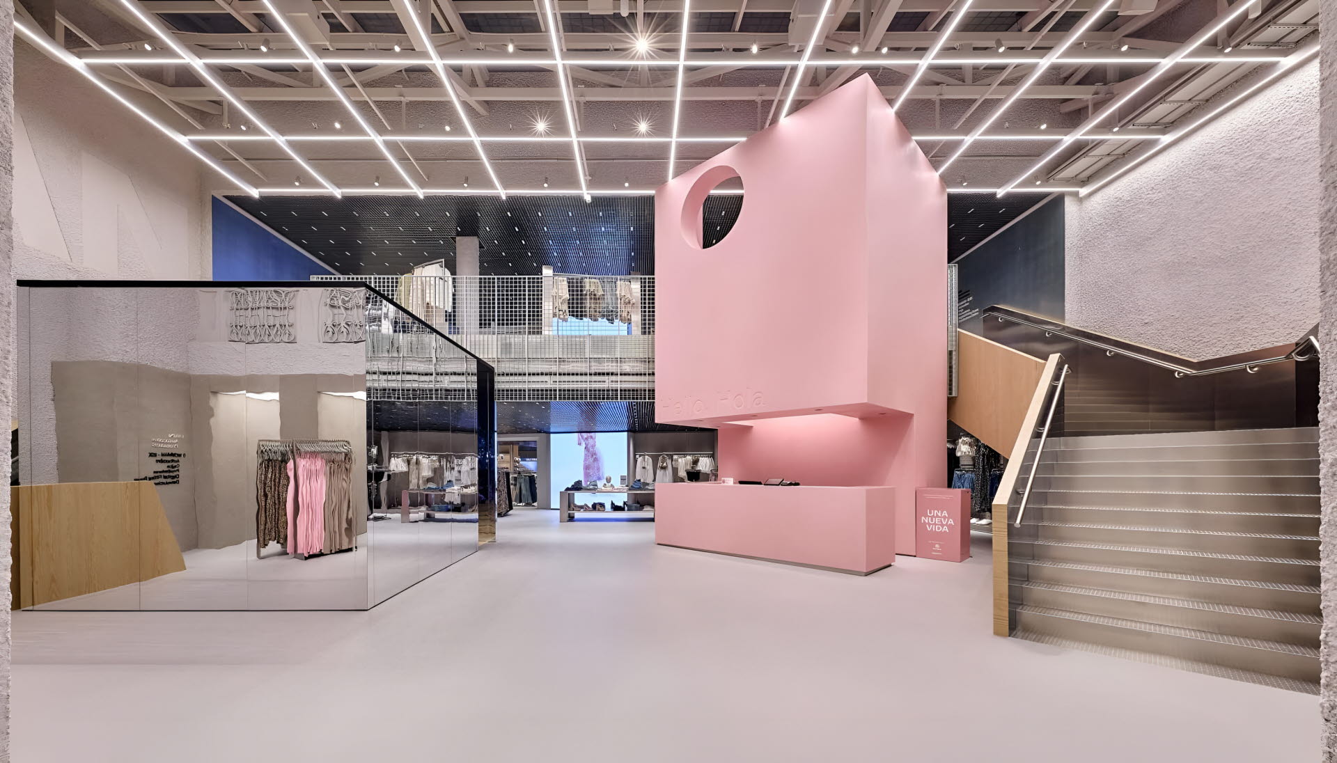
Bershka, Valencia
As soon as you see the term ‘flagship’ applied to a store, then it will probably have something that marks it out as different from the herd. In this instance a dusty pink, near store-high, cube-like structure captures the eye from the moment the shopper enters the store. A tube lighting grid is above this and another rectangular box-like installation is mirrored all over.
The purpose of all this is to offer something different and it works – following in part the lead set by the Bershka store in Milan, designed by Dutch consultancy OMA, which opened in late 2023.
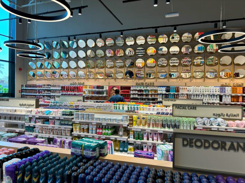
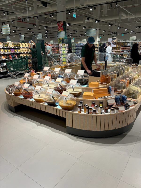
Spinneys, Riyadh
It’s not often that coach excursions have a supermarket as their final destination, but in the Saudi capital the newly opened supermarket from Dubai-based Spinneys has them packing the aisles. The reason is simple.
This is a store in which the best of European food retailing, think Waitrose, Rewe and perhaps a Marks & Spencer food hall, appear to have come together and been coupled with high levels of counter service and a substantial footprint. More are set to follow in the ‘Kingdom’ and it’s hard not to think that a similar reaction will be encountered.
Crate & Barrel, Broadway, NYC
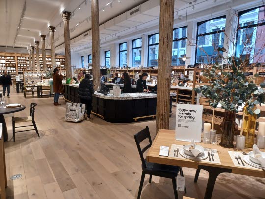
Spacious interiors, a neutral fitout and an outfit that is not afraid of making a feature of the cashdesk, putting it in the middle of the ground floor. This is almost an exercise in soft monotone on the from the moment the shoppers enters and downstairs the feel is that of a sophisticated apartment.
Yet the prices are not what might be expected of such a considered interior. It’s affordable and easy on the eye at the same time. This one can stand up to all comers as far as offering a furniture and homewares environment is concerned.
Primark, Salamanca barrio, Madrid
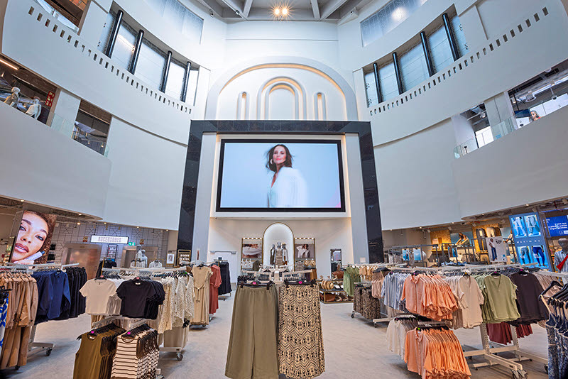
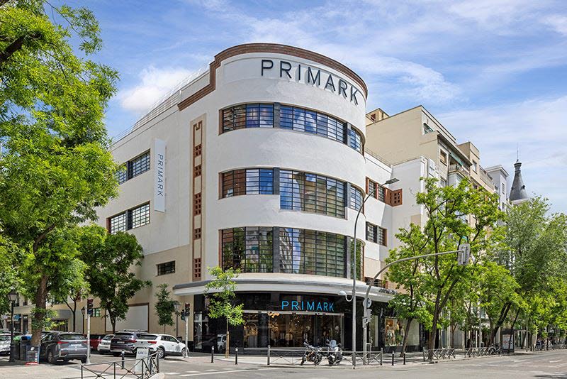
Repurposing a landmark and turning it into a store runs the risk of trashing a heritage in the name of profit. Not so the recently opened Primark in Madrid’s Salamanca barrio. This was an Art Deco cinema and now it is a purveyor of cost-conscious fashion, but the sense of what it was remains ever-present thanks to the use of the space where the cinema screen would have been being turned into, well, a screen, acting as a mood setter. The curving windows of the exterior have been retained, and this remains a landmark, except that now it’s a shop, rather than a movie house.
Zara, rue de Rivoli, Paris
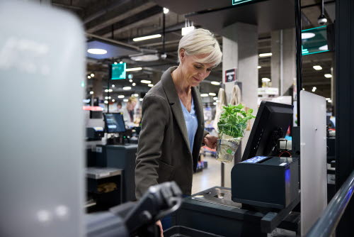
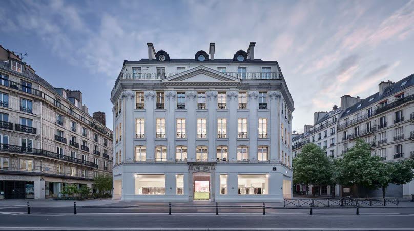
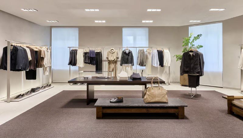
Paris seems to be something of a special case for Zara. Its store on the Champs Elysées would be a contender for any ‘best of’ list, but now that crown is threatened by the remodelled 2,100 sq m multi-floor branch on the Rue de Rivoli, just down the road from the Louvre. A grand exterior beckons shoppers to enter a store in which sleek minimalism is coupled with the increasingly prevalent use of tech in the form of click and collect, self-checkouts and screens across all levels. It is obviously debatable whether this is the best Zara, but it has to be among the top few.
H&M, Kings Road, London
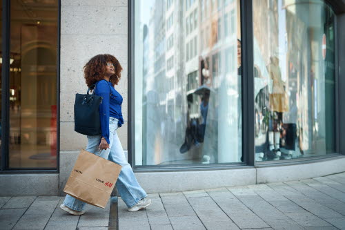
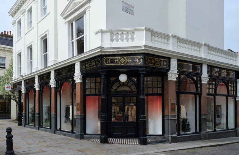
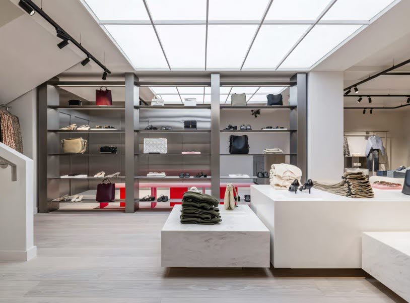
The Swedish fashion retailer is beginning to open ‘elevated’ stores and the Kings Road branch is one of the first. Situated in a space that has long harboured fashion, it was ‘Lord John’ in the 1970s, this looks pretty much the same as it has always done from the outside. Within, this is a stripped back and very Scandi interior of the kind that would have the ‘high price’ alert sounding loudly. Except that this is H&M. It is possible to create budget stores that feel upscale, providing the replenishment operation is in order and this is one of the best examples of what can be done.
Other insights
Discover similar industry insights.

