Theatrical merchandising and new layout increases sales
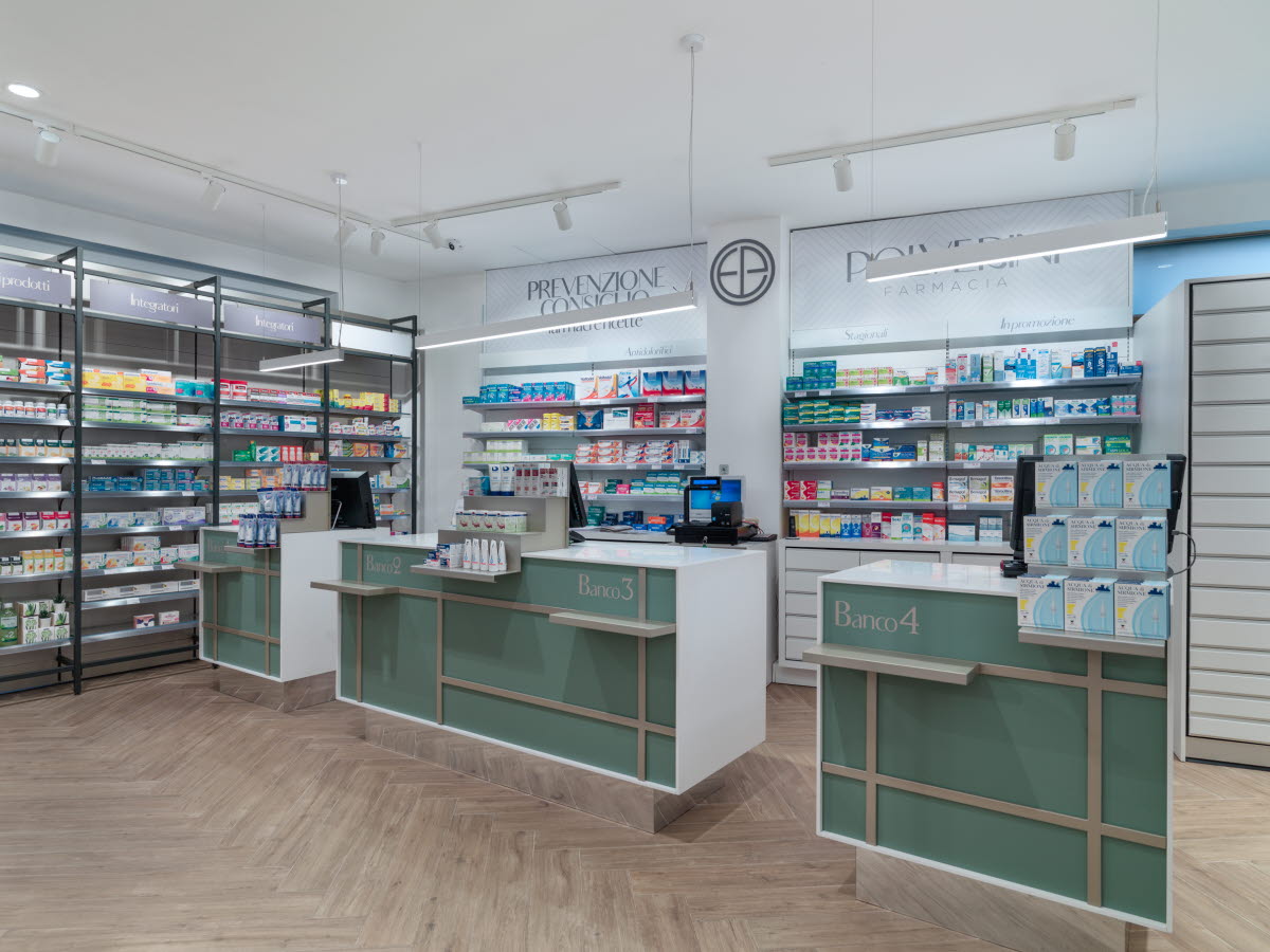
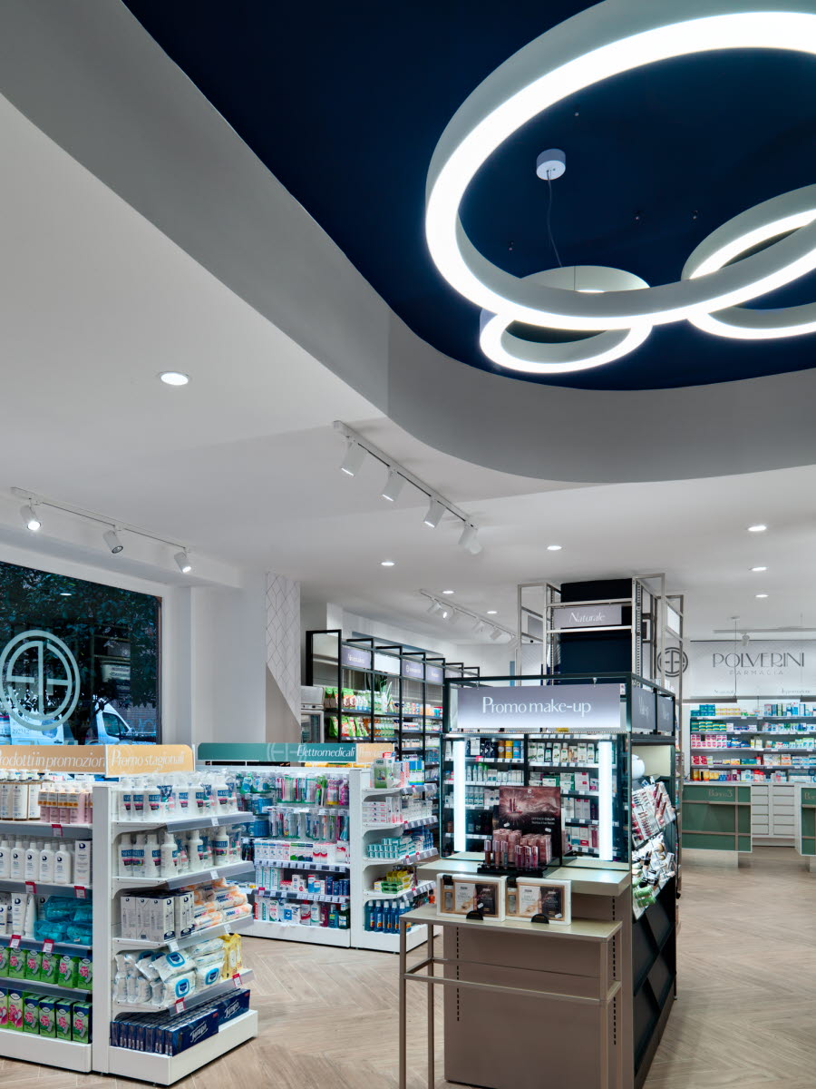
With playful lights, graphics and retail design, Polverini’s new pharmacy concept has an attractive, theatrical merchandising. Different colours and shapes of the interior work together with the supporting lights and graphics to deliver a new elegance to the store. The attractive areas are a great influence on buying behaviour and have uplifted sales.
The layout of the store has also been optimised to help this. A pleasant flow now supports the consumers through their journey – from inspiration to purchases, optimising consumer throughput and reducing walkouts.


