Theatrical Retail Design Concept Uplifted Beauty Sales
Unique and smart retail design concept guides and inspires pharmacy consumers to a new level.
Confusion and outdated design
When the pharmacy Polverini reached out to us, they faced issues such as an outdated and misunderstood retail design concept and a problematic store layout. Their two entrances confused the visitors and lack of display area made it hard for any additional sales promotion.
Lighting, format and displays
We dug into the challenges and two objectives were identified for the project; increase the sales area and visualize their focus on beauty in the retail design concept. After studying the brand, the layout and its scope for improvements, our brand experience designers looked at the complete picture. Lighting, format and displays were evaluated, and new solutions came into view.
Theatrical merchandising and edgy colours and shapes
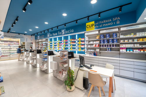
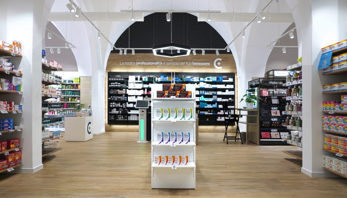
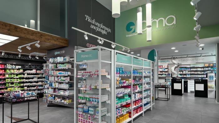
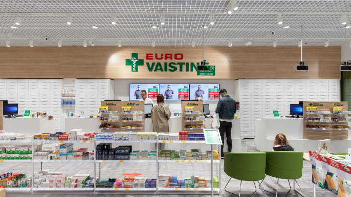
By playing with lights, graphics and retail design, Polverini now have attractive, even theatrical merchandising. Different colours and shapes of the interior work together with the supporting lights and graphics to deliver a new elegance to the store. The overall layout of the store supports the consumers through their journey from inspiration to purchase. Cosmetics are placed at the entrance with a free service area generating uplifted sales.


