New retail design gave pharmacy 95% more promotion area
When this pharmacy became a part of a group, they decided to develop a new retail design. An increased inspiration and promotion area was the goal.
Historical architecture made room for inspiring retail design
When Medaglie D’oro, an Italian pharmacy, became a part of the Grana group, a decision was made to enhance the retail design and store experience. The existing store lacked room for promotion so consumers were uninspired and could not find what they were looking for, although the historical and architectural location offered something extra.
Flexible retail design to stay up to date with consumer trends
To develop a format suiting the architecture and giving room for consumer needs, a layout and warehouse analysis was made. The development of a strong and differentiating brand image would support it further. We looked into health and beauty trends, held workshops focused on the consumers, and then started the retail design process. A collaboration between graphic designers, lighting designers, and store designers delivered a new, inspirational, and highly representative brand image.
Robotic warehouse solution increased promotion area to 95%
Through the study of the layout and the implementation of a robotic warehouse, we were able to exploit 95% of the surface available on the ground floor as experience and sales area. The new space created room for the new brand experience with new and optimized promotion areas.
Clear guidance and elegant product display
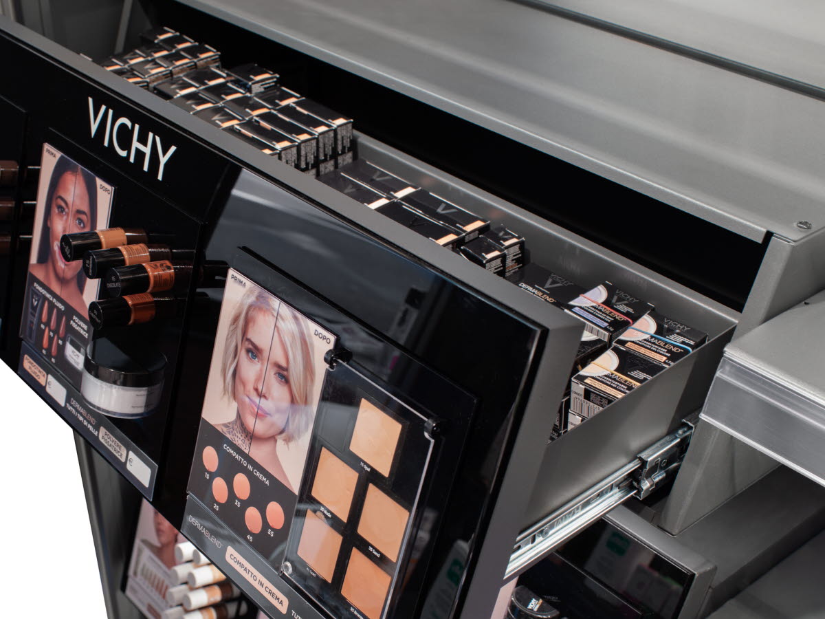
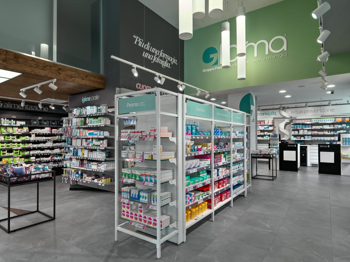
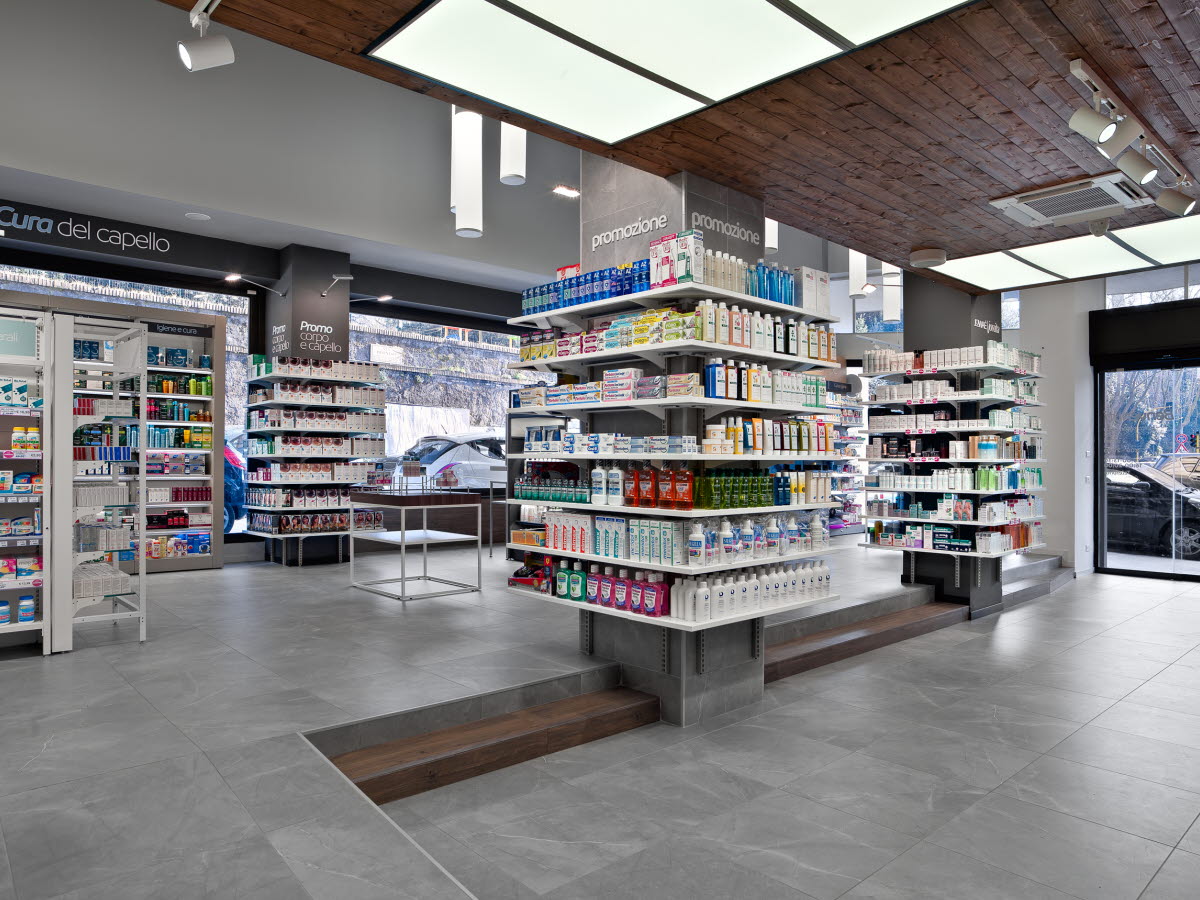
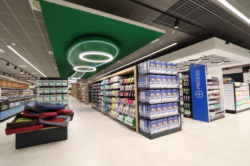
The new format Is clearly divided into separate focus areas with thoughtful inspiration In between. Linear aisles help consumers easily find what they are looking for, inspiring purchase decisions that uplift sales. All Interiors and lighting are configured for elegant product display, simplicity, and clean design.

