New front-end & checkout proposition
Asda, one of the largest supermarket chains in the UK, needed to improve its consumer experience and enhance operational efficiency in its front-end and checkout arena.
Providing greater consumer choice and improving operations
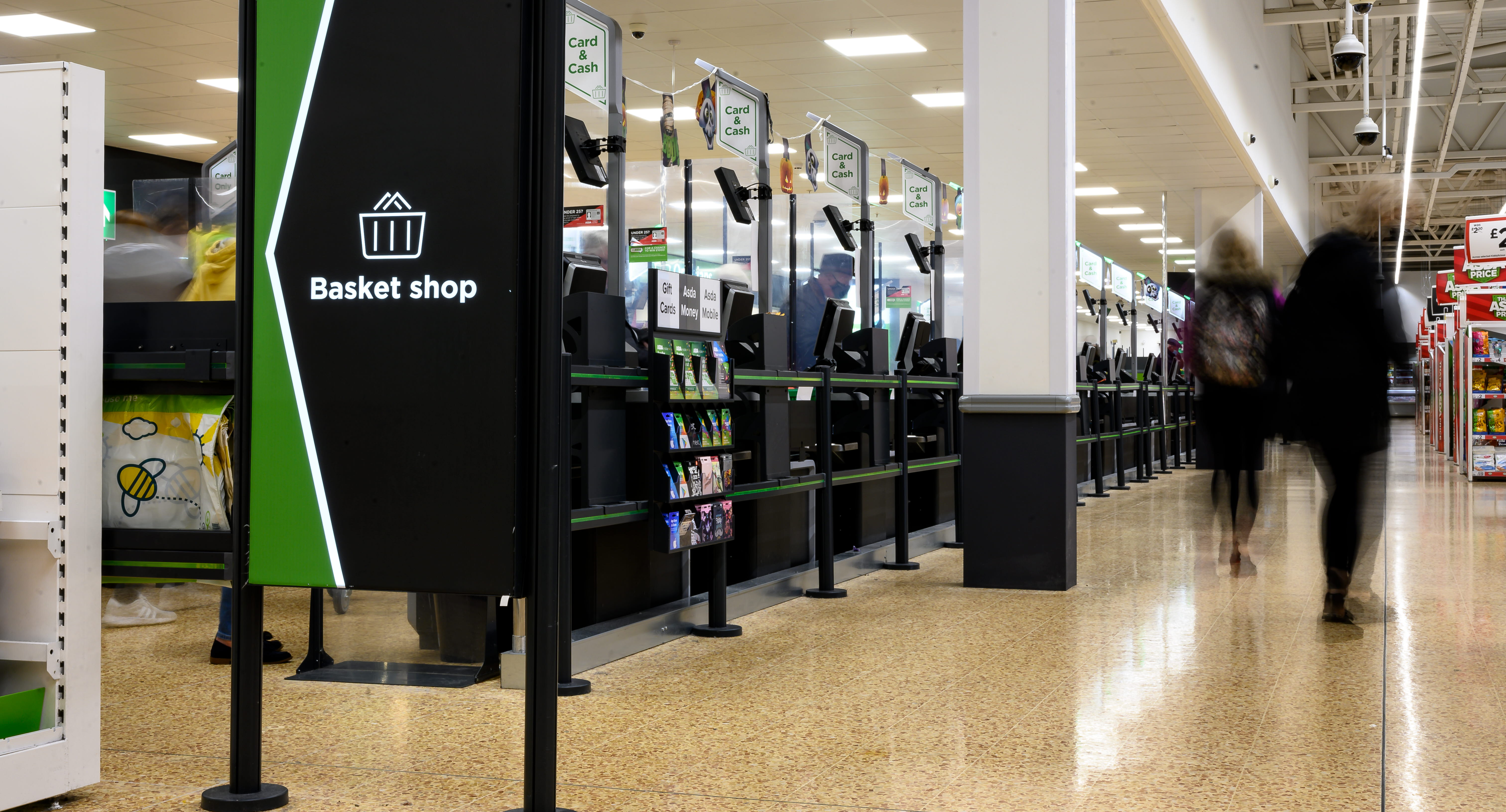
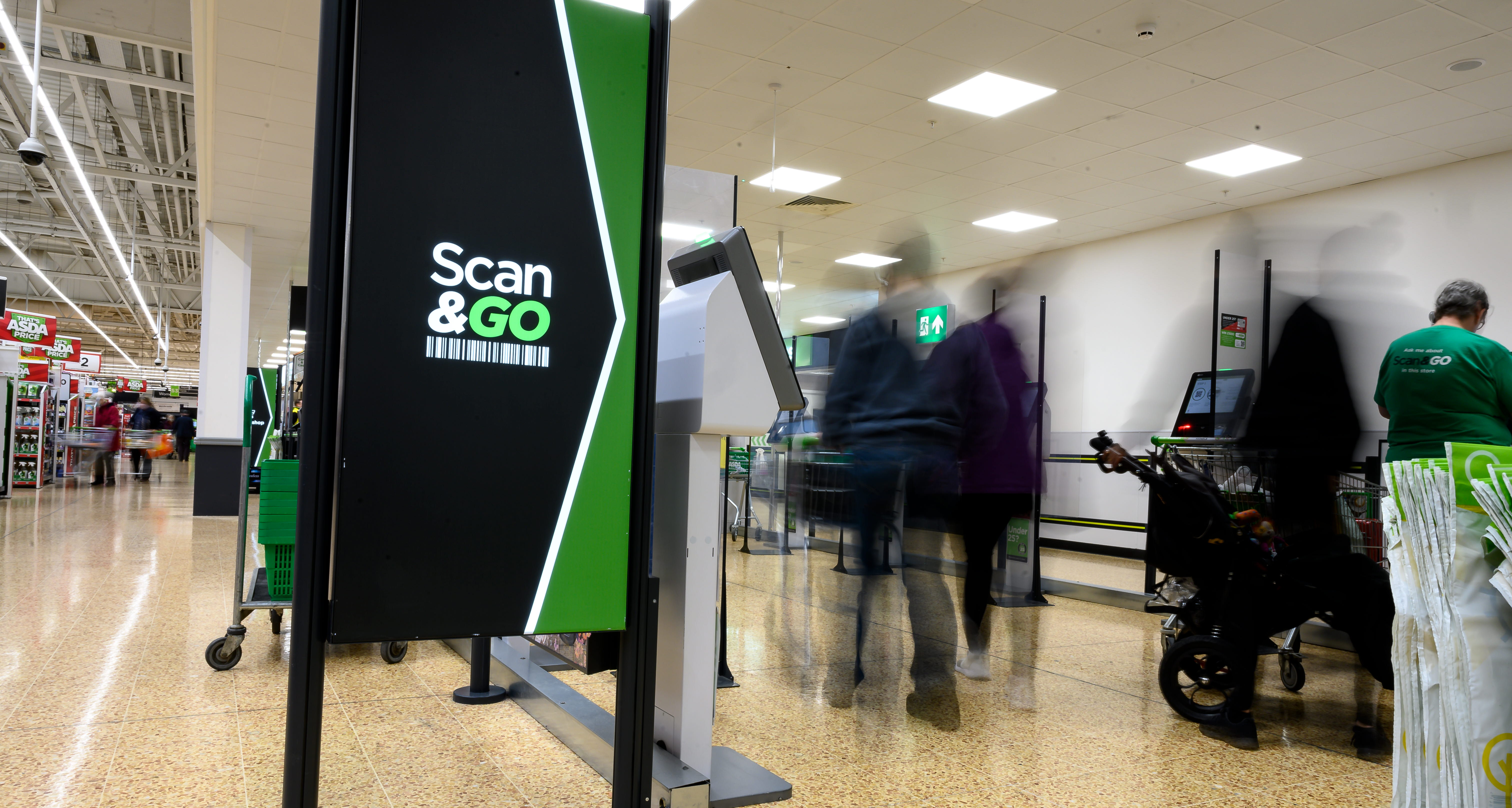
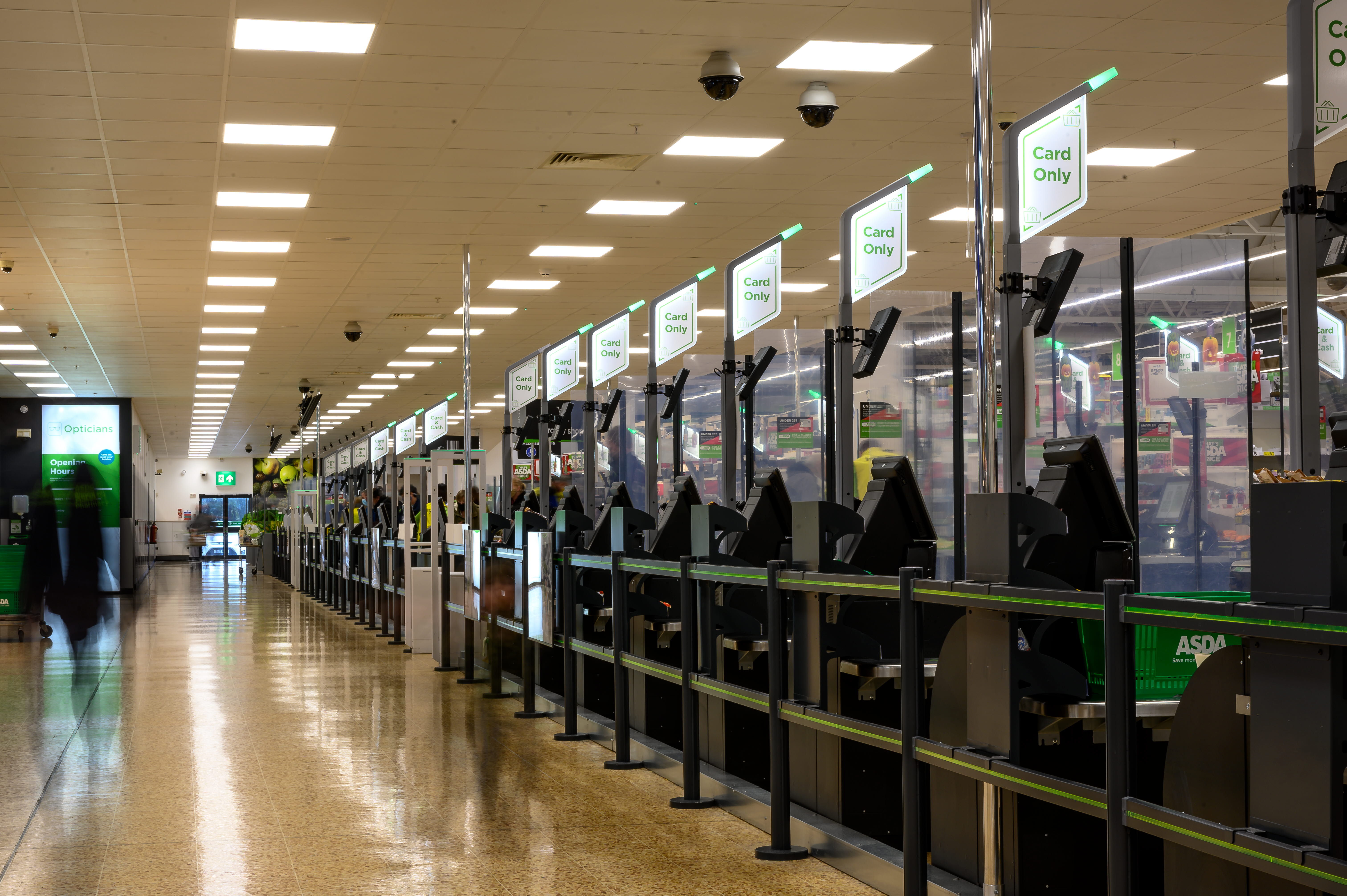
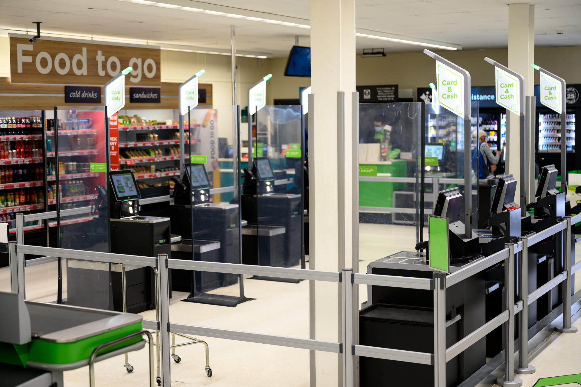
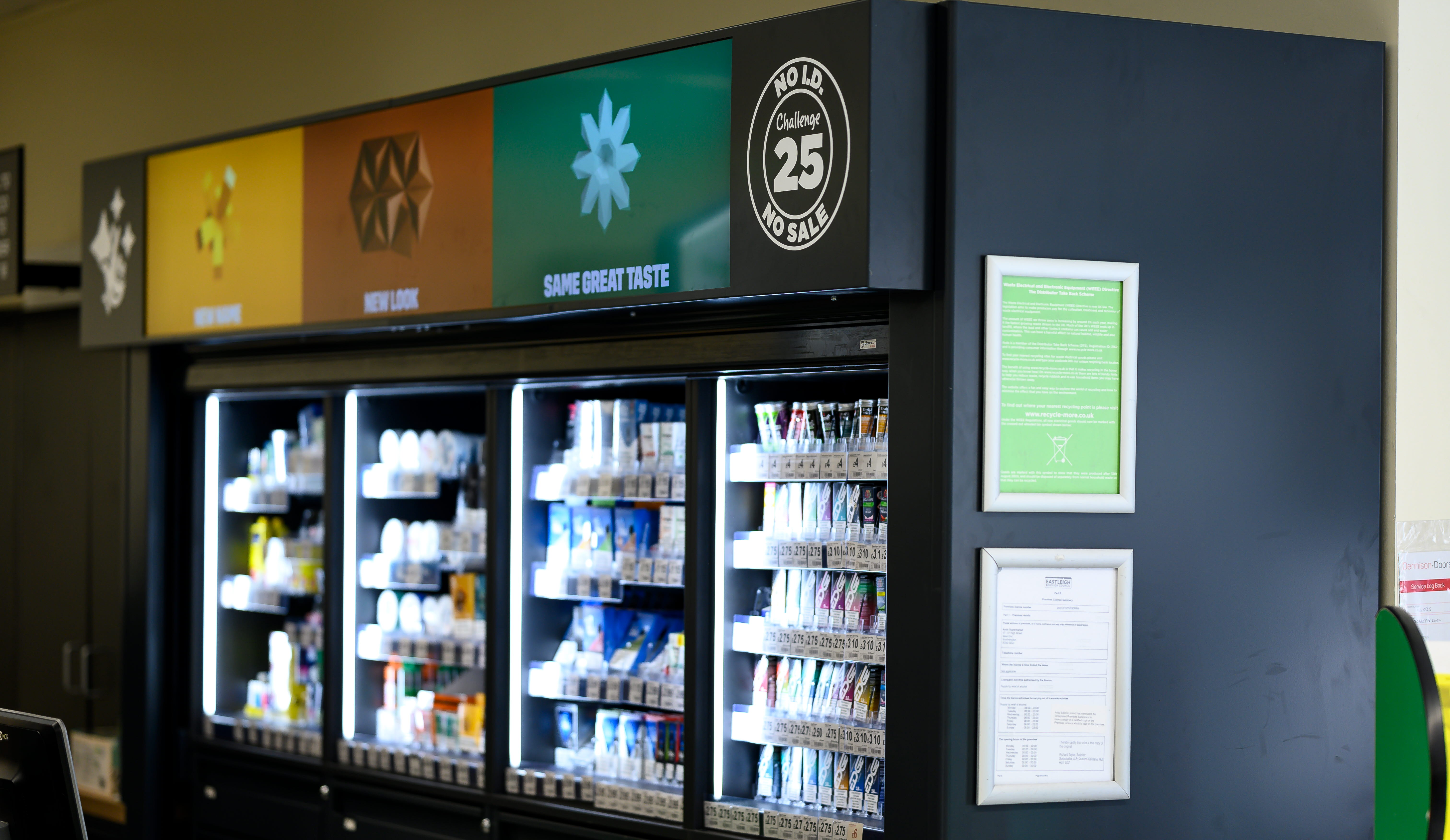
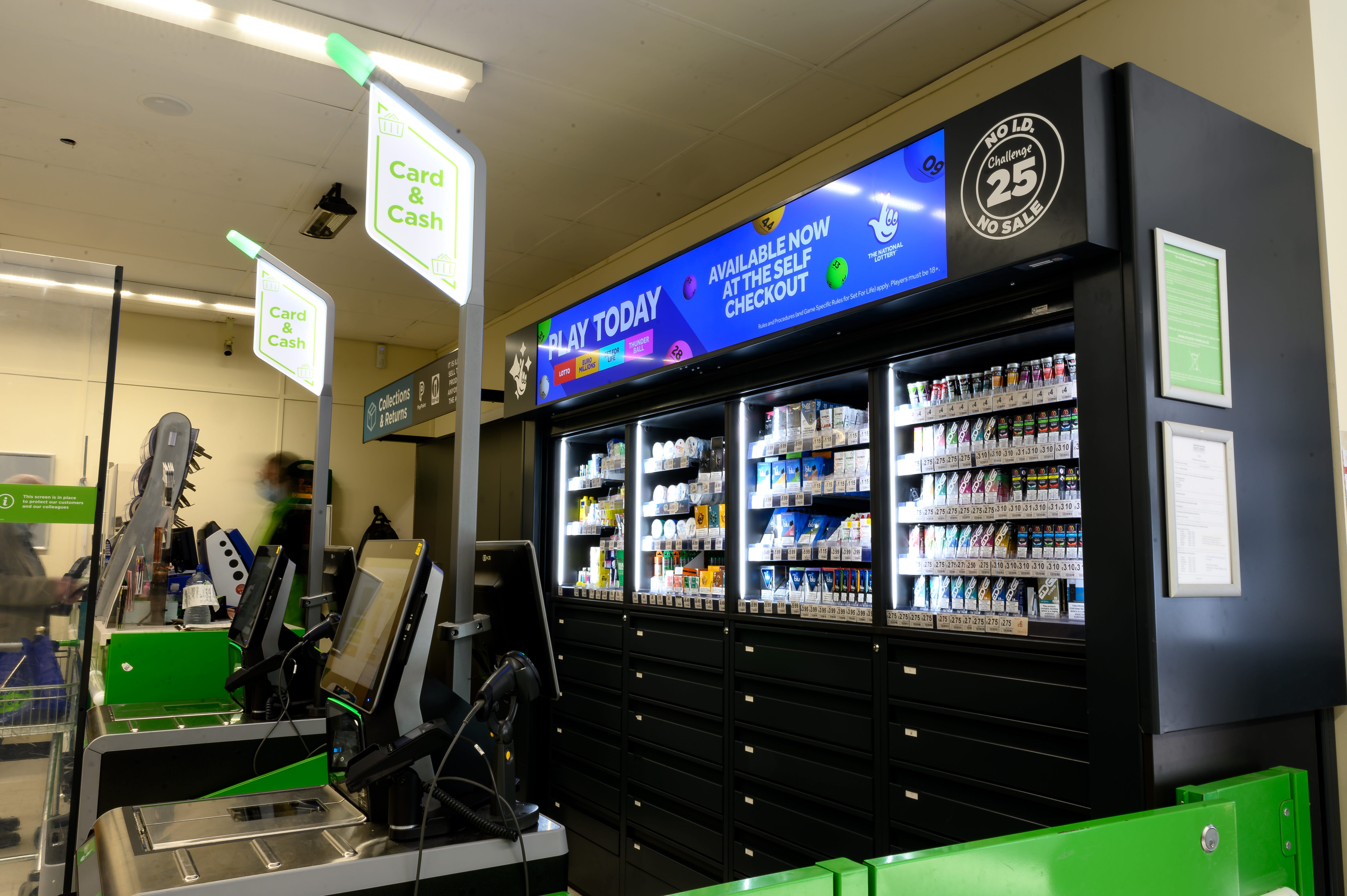
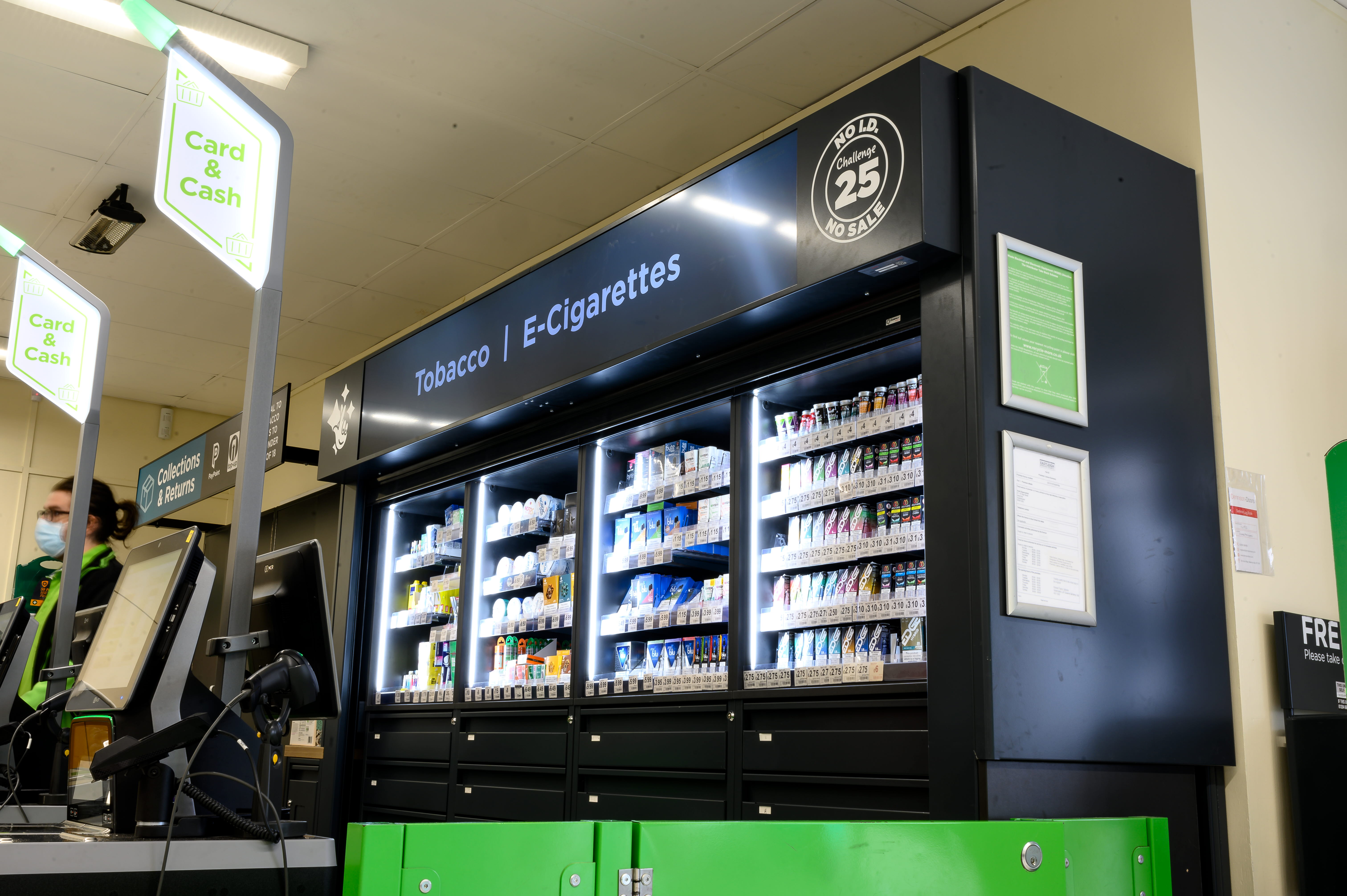
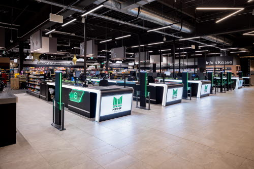
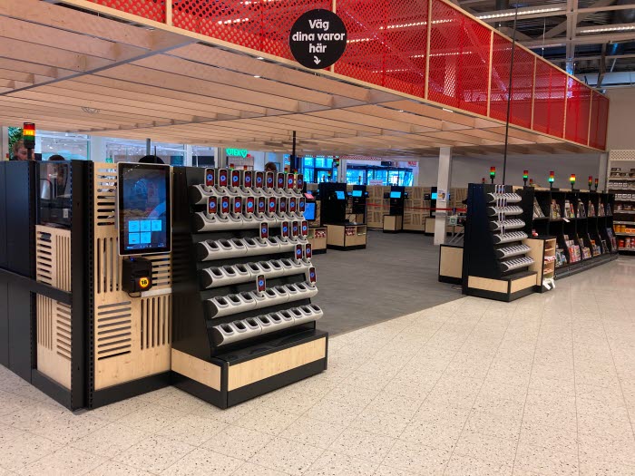
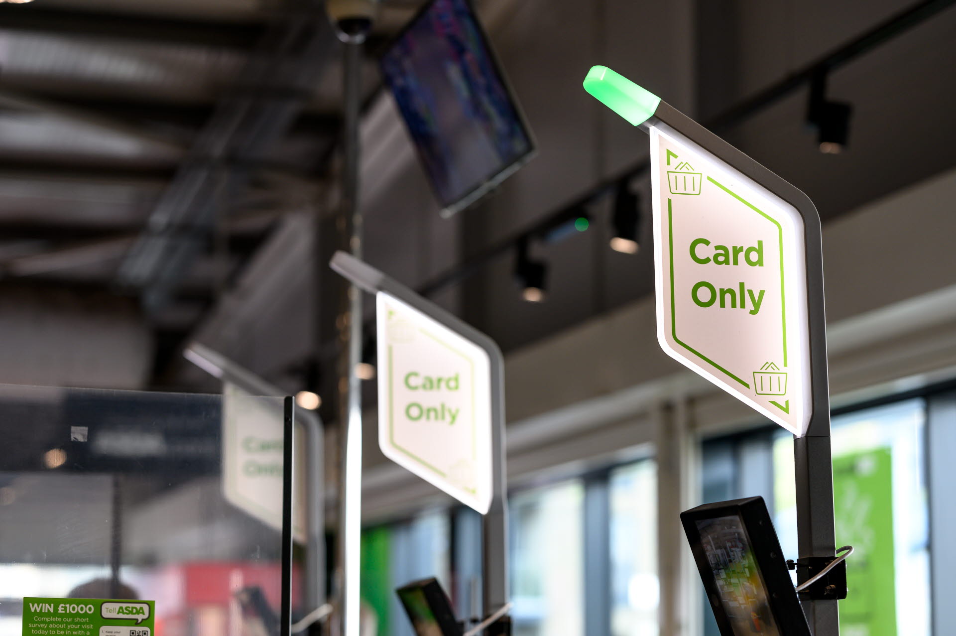
ITAB worked closely with Asda to develop a new front-end and checkout proposition, looking to offer greater choice, speed of service and convenience for consumers. By evolving the front-end arena setup to incorporate manned and self-serve payment routes, Asda were able to improve throughput, ease colleague operations and increase sales conversion.
Improved layout & flow through solution design
By gathering data & insight ITAB developed a greater understanding of Asda’s consumer needs, identified specific challenges, and defined the key areas of leverage along the end-to-end shopping mission. Examining the shopping experience through the eyes of the consumer allowed Asda and ITAB to co-create a new layout for front-end and checkouts.
Category Refresh: Beer, wine & spirit
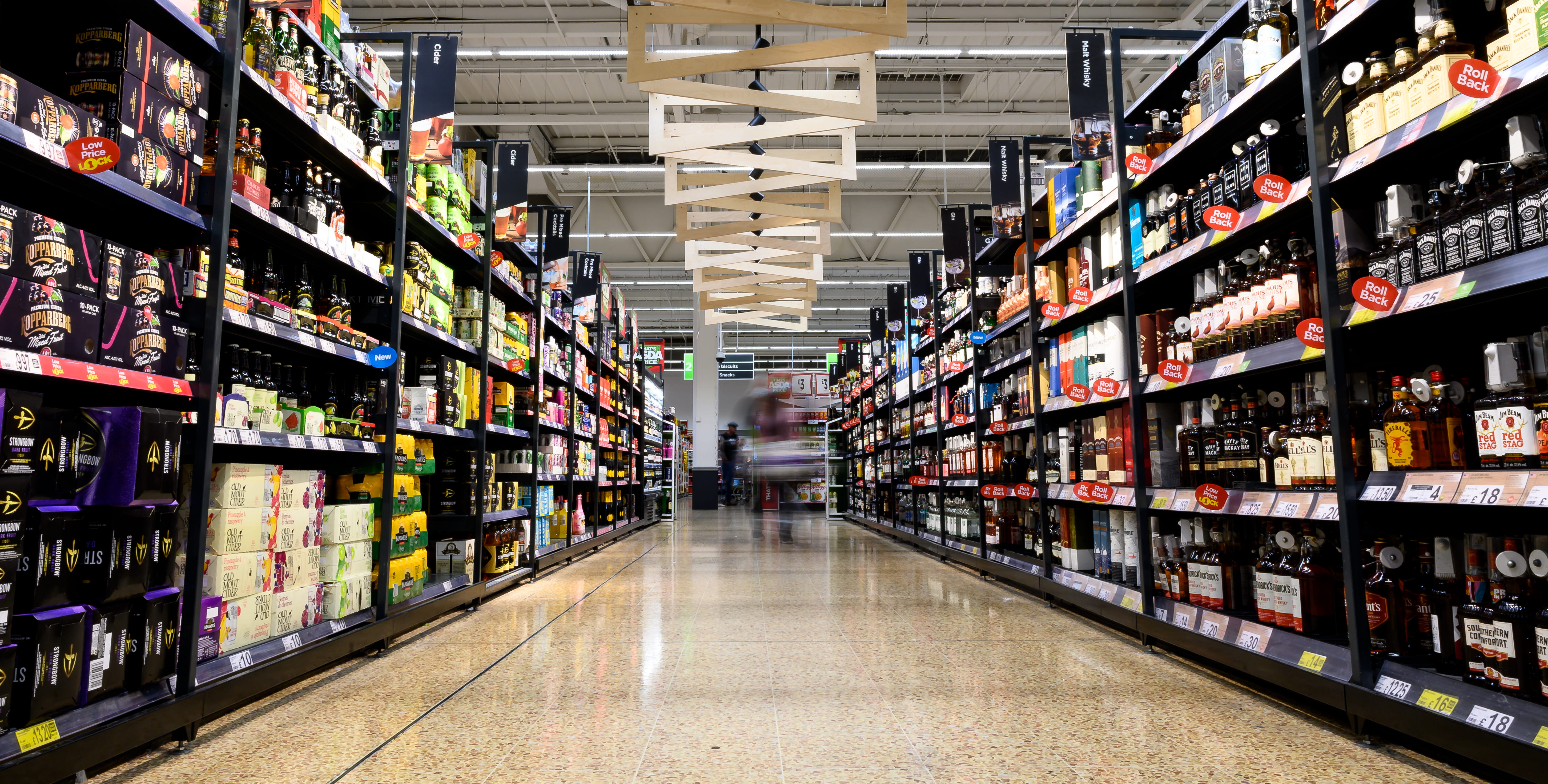
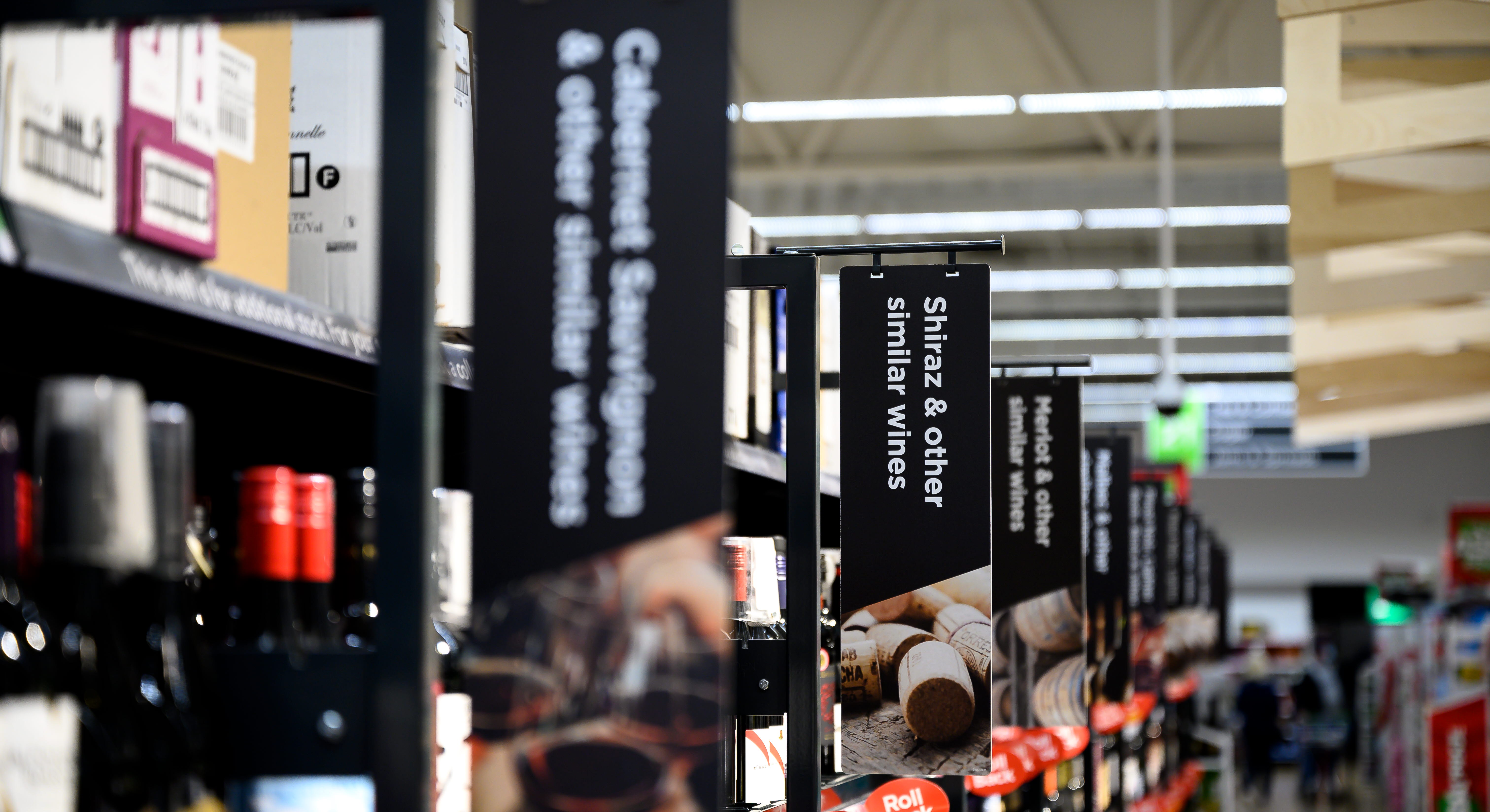
As part of the ongoing partnership between Asda and ITAB, the beer, wine and spirit categories were refreshed to provide a more engaging environment, and to reflect more premium product lines. New furniture, signage and high-level treatment heightens the consumer experience, while easing shopping missions and encouraging longer dwell times.
Improved signage & dynamic digital content
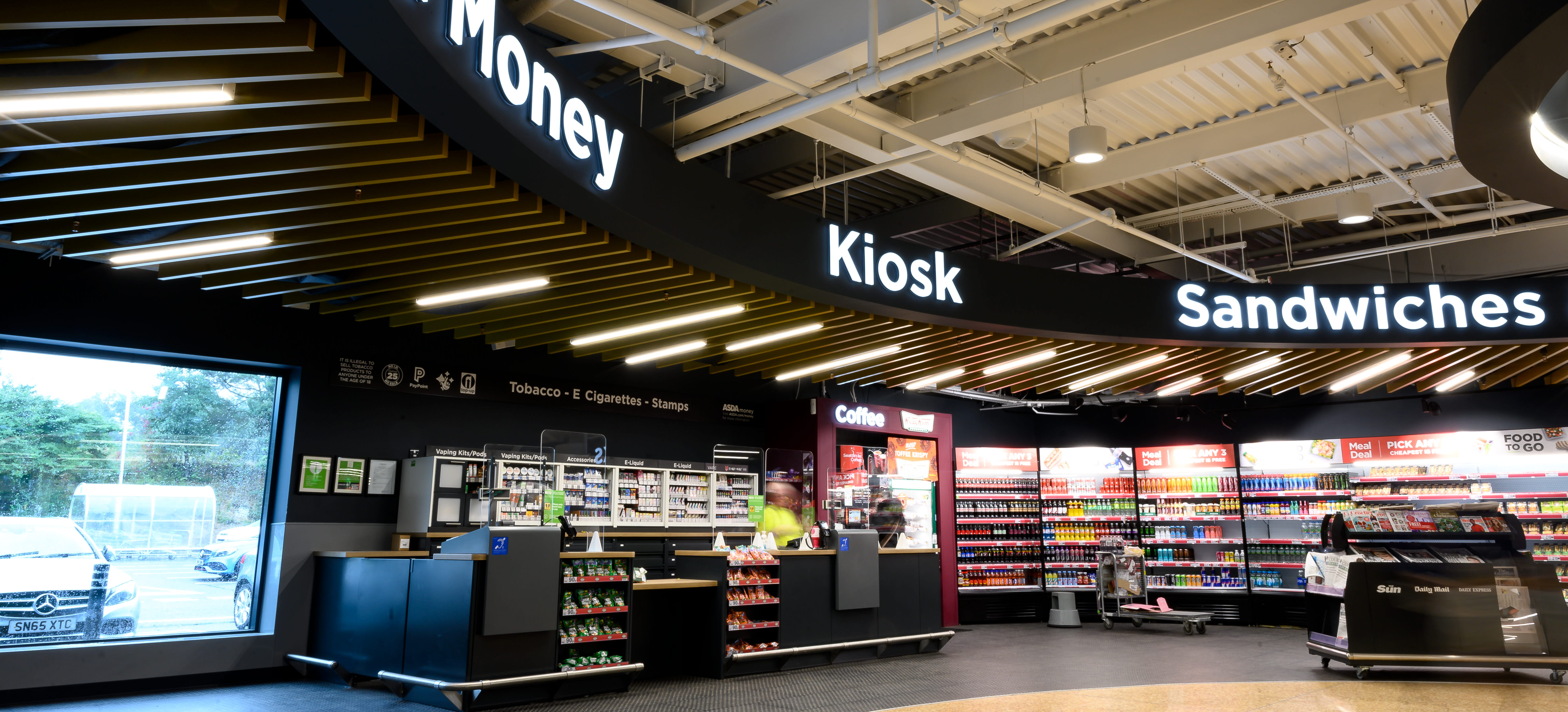
Utilising ITAB knowhow and our technology focused eco-system partners, a dynamic digital solution has been trialled on the front-end kiosk. Rolling content provides greatly improved in-store navigation, added visibility, and reduces consumer confusion after they have entered stores.
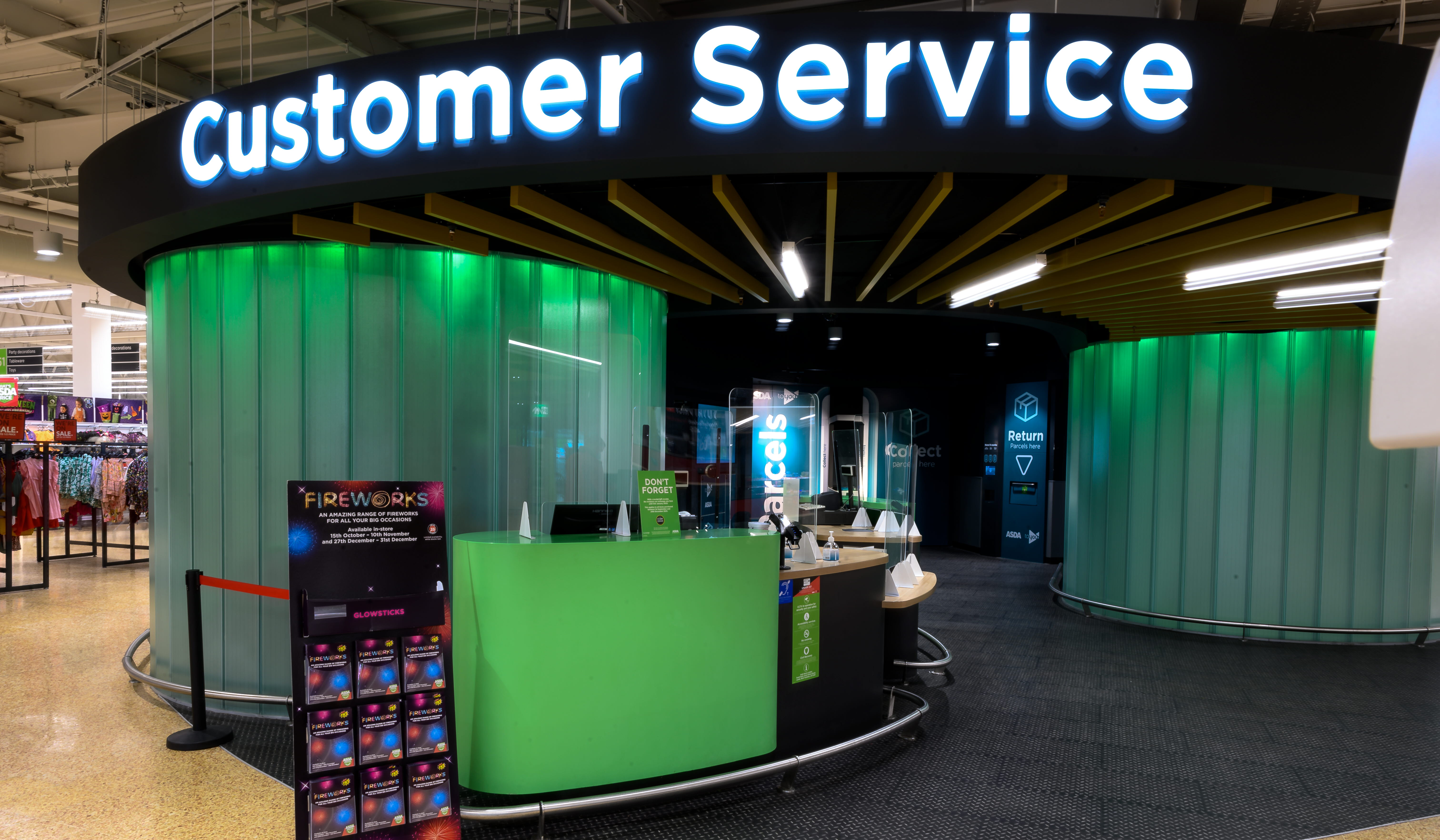
Customer service desks
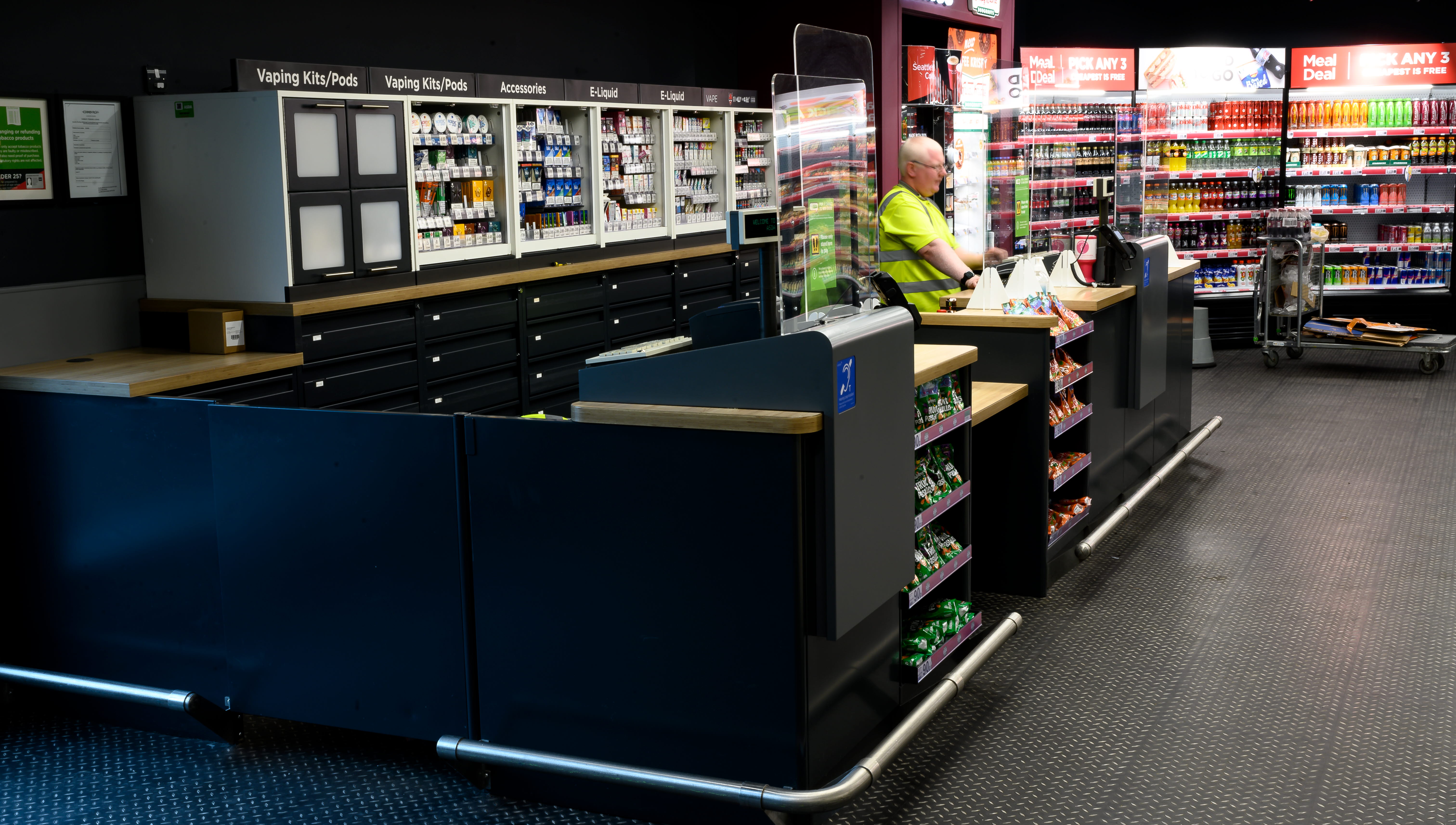
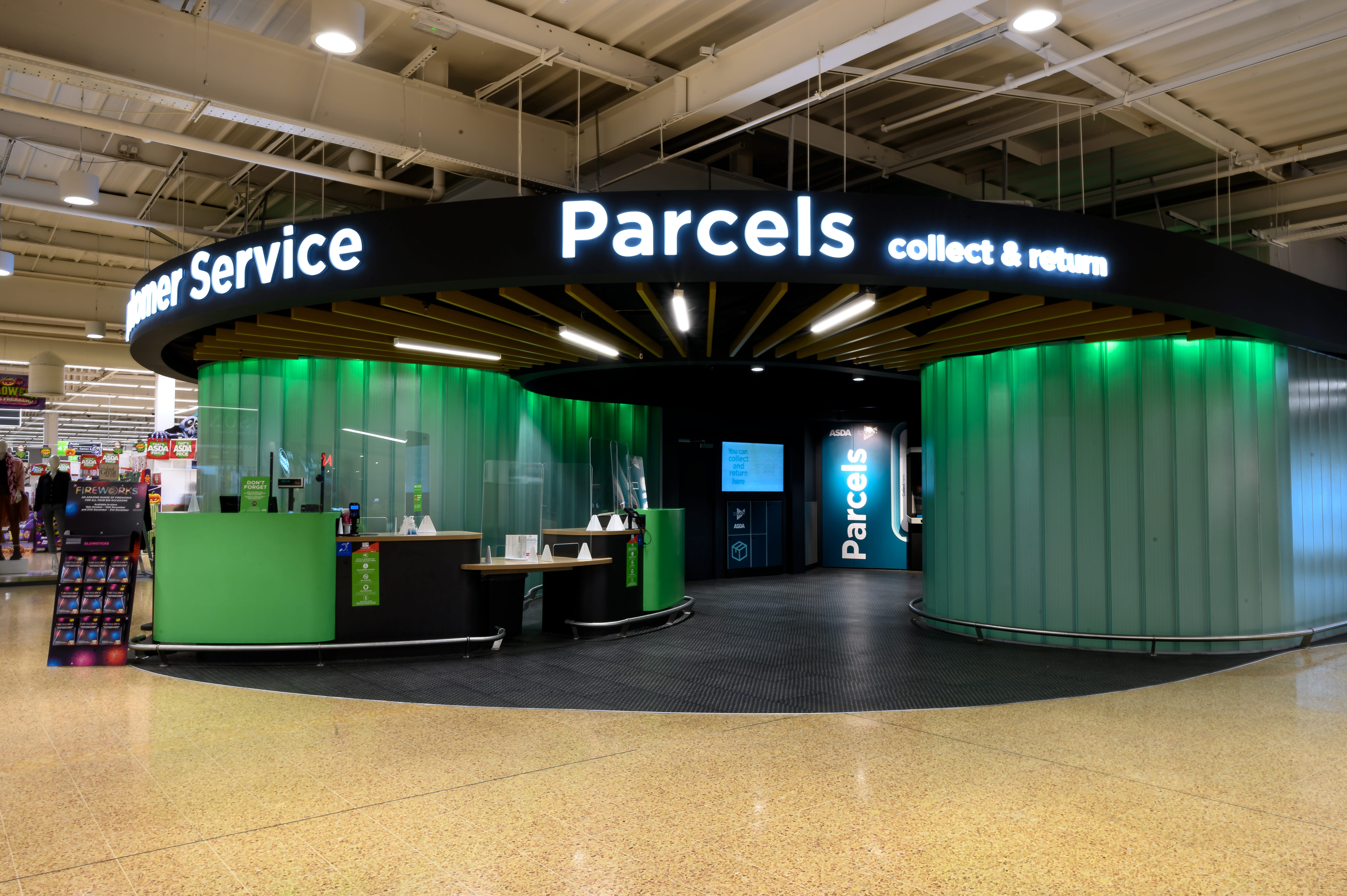
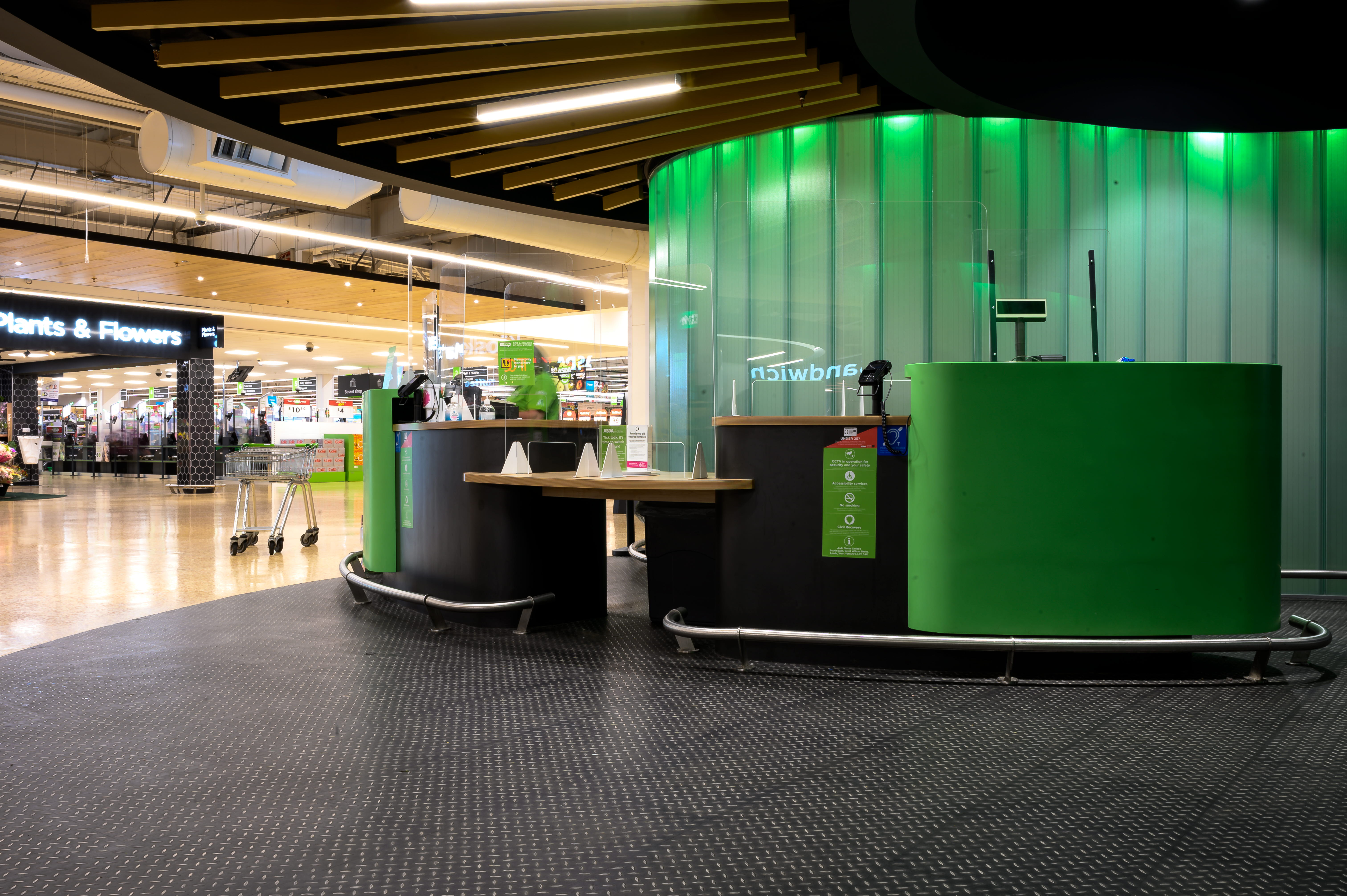
ITAB supported Asda in re-imagining their existing customer service area and front-end kiosks. The end result was a considered kiosk design that engages consumers, eases colleagues’ daily tasks, and that has been engineered for scale.
RELATED CASES
Get further inspiration from similar concepts
