A seamless experience in a new city store format
An enhanced brand experience has been created for KungSängen in the Mall of Scandinavia, Stockholm. A new and updated store concept with integrated digital solutions to increase sales and improve service.
KungSängen, is one of Sweden’s largest bed retailers. They can proudly say that machines do not make as comfortable beds as human hands. The history of crafting was something that lay the foundation of the collaboration, creating the new store concept together with ITAB.
Creating a flexible store format
In the past, ITAB together with KungSängen, opened stores in slightly larger shopping centres around Sweden. In recent years however, the need for a city concept was needed, to be able to open more stores within city locations.
KungSängen’s concept was improved and updated to something that better reflected their brand, with a city concept for specific locations.
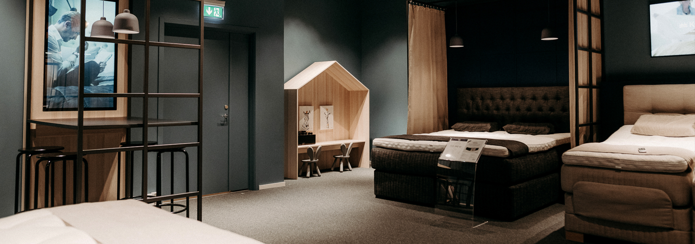
One of the new additions to the concept was a children’s corner to make it easy for families with children to try beds with less distraction. The ITAB Design team and KungSängen created this together, and the first store to receive it was at the Mall of Scandinavia, which is now one of their most visited stores.
Creating a seamless digital experience in a physical space
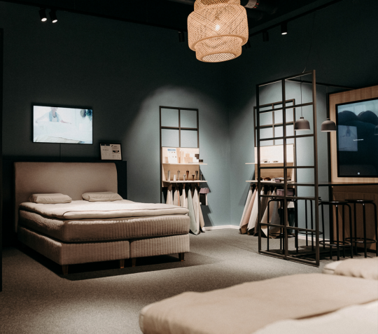
Many consumers who visit the store say that it feels very homely, the testing of beds feels more natural and almost like home.
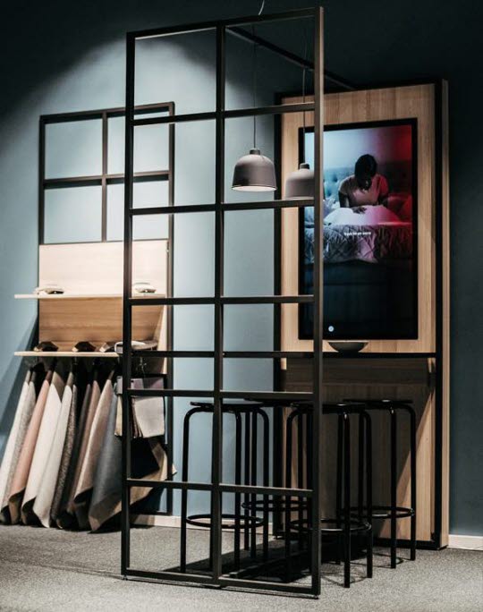
After testing, the consumer can sit within the bed studio to look at materials and other accessories. They will find everything in a web kiosk that is integrated into the interior. The screens show inspirational videos and when you click on the screen, it will take them to KungSängen’s website. By introducing them to products that meet their individual needs, staff can provide a valuable service and build consumer loyalty.
Guided selling tools increase sales in two ways. Firstly, for consumers who are trying to make a specific purchase, and secondly for consumers that are just browsing. It also makes it possible to show products that are out of stock, meaning a consumer can find the exact product they want to purchase and place an order, even if it is not currently available.
Screens to enhance the desired consumer experience
Other screens placed in the store show inspirational films, campaigns, and ads. These contribute to a clear and relevant message that is continuously updated. It also creates a better working environment for staff, who do not have to continuously change these messages, freeing them up to spend more time with consumers.
Self-service at the choice of the consumer
In the city concept, we have chosen to develop a smaller checkout than the traditional manned checkout, to save space, but also provide the opportunity to reduce the number of non-value add tasks. This, together with the web kiosks in the store, means that the digitalisation of the concept has been able to help the staff free up time to put more focus on consumer service and rigorous testing.
Related Cases
Get further inspiration from similar concepts
