An attention-grabbing grocery experience
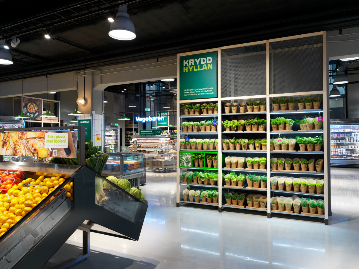
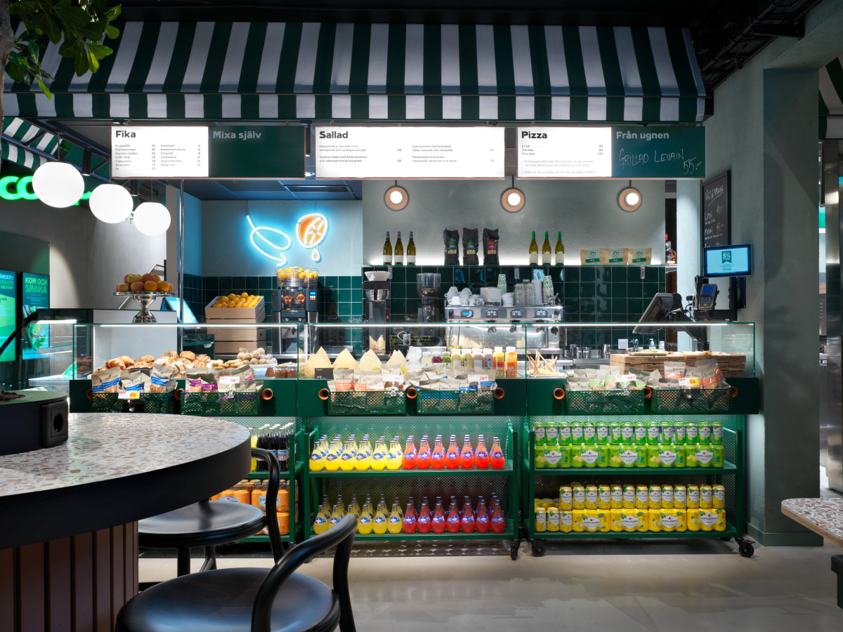
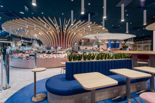
To deliver a customer experience offering that little extra, Coop decided that their next store opening should become a completely new experience store. Divided into two floors, the plan was to create one relaxing café and restaurant area, and one exclusive, innovative supermarket – all customised in the most sustainable way.
Focus on sustainability and innovation
Big dreams in combination with a small area and a tight time schedule might be a tricky equation to solve. To avoid any compromise on the wanted experience and improved efficiency, ITAB worked closely with architects and Coop to find smart solutions.
Analysing flow and lighting impact
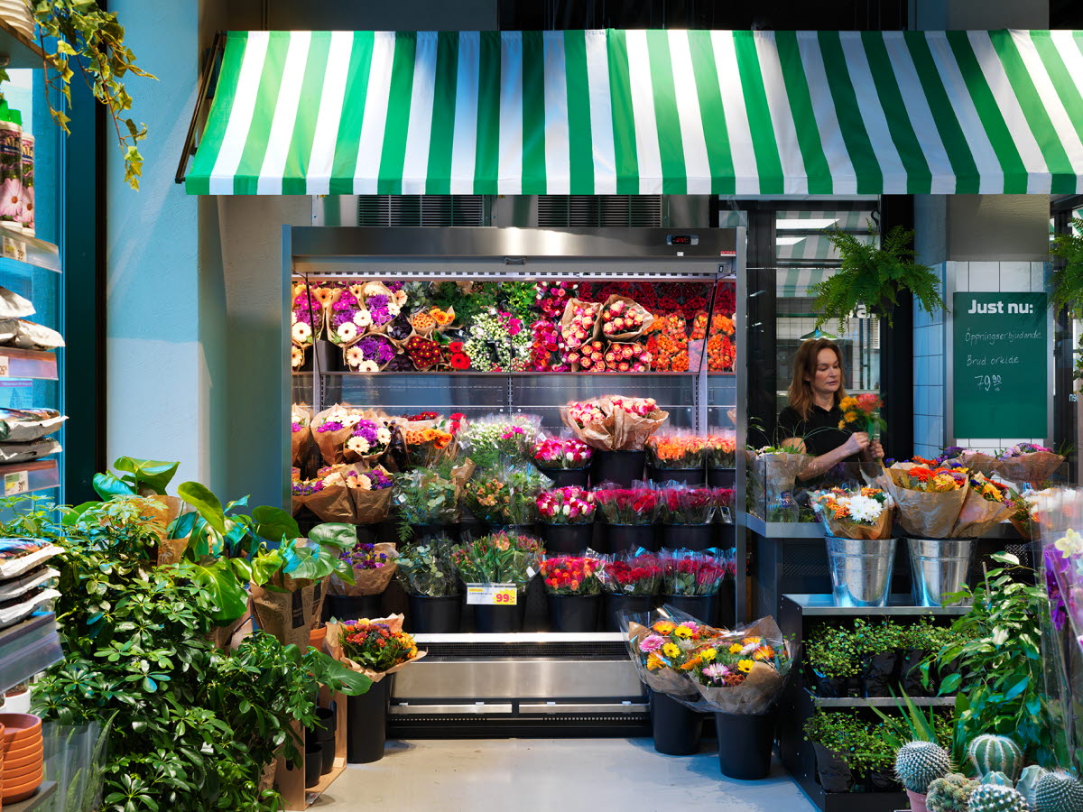
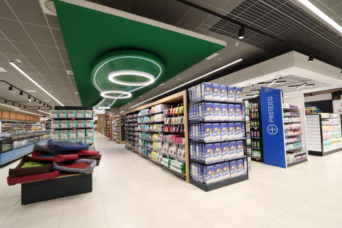
The layout of the store was carefully evaluated and designed to create a pleasant customer flow and optimal merchandising solutions. Every detail was put in place to support dwell time, increased sales, and reduced waiting for the customer.
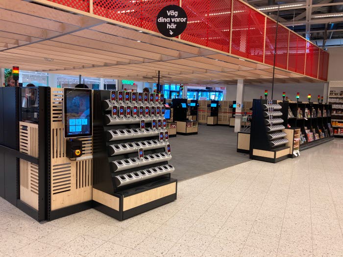
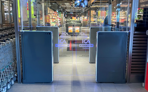
To translate the Coop brand into a sustainable and innovative customer experience, details in sustainable material were added throughout the store design. Solutions such as seamless pay via mobile phone and guiding digital screens were added to the concept to give the most value possible to the visitors, as well as to achieve the desired innovative flavour.
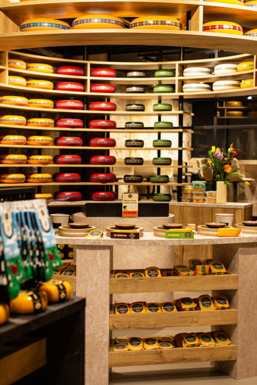
A decision was taken that most of the furniture should be customized, designed, and produced in the most sustainable material possible. We used the full potential of the space to make it efficient, and at the same time deliver a pleasant experience.
The café floor attracts new buyers
The café floor of Coop is now an enjoyable space that attracts many customers, even those that aren’t regular buyers. It might be the welcoming layout or the sustainable feeling which makes it a popular, relaxing space for lunch or coffee.
When the customers have finished their meal, they naturally stop by the supermarket floor to buy what they need for breakfast. Increased sales, for sure!
Unique design and app payments uplift the supermarket floor
The unique, cutting-edge furniture, the well-designed layout and the innovative solutions like the app payments, make this a well-visited space, not just by consumers. Many interested retailers often stop by to take a look at the elegant merchandising that guides and at the same time increases sales.
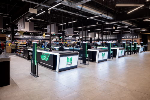
To help in the critical purchase phase, the consumer meets a well-designed checkout area. The reason it’s rather small is that the main payment method is, as mentioned above, connected directly to an app. The mix of payment methods supports any consumer’s need.

